– Overview –
Problem
People who use many different platforms to post and document their lives (especially some influencers) find it difficult for them to track, manage all their posts as if the physical photos they took using film cameras are scattered in different corners of their homes and there is no one album to organize.
So, how might they sync, organize and review all their posts in one place?
Solution
I designed a new feature called Moment Archive in an existing app Are:na (an internet bookmarking app for organizing and saving content) to bring together posts from different places into one place, synchronize updated posts, and organize, categorize and review all posts efficiently.
TOOLS USED
Figma
Adobe Creative Suite
TEAM MEMBER
Ao Chen (Individual graduate course project from ‘User Experience Design’)
TIMELINE
Mar 2022 – Apr 2022 (2 months)
MY ROLE
UX Research: Problem Definition, Interview, Survey, Competitive Analysis, Journey Mapping, Feature Prioritization, Usability testings
UX Design: User Flow, Wireframing, Clickable Prototyping in Figma, UI design.
Track All Your Social Media Activities In One Place
Tired of managing multiple social media accounts? With Moment Archive, you could track all your posts in one place!
Instantly find what you need by sorting and searching for information.
Categorize & Manage Posts at Fingertip
By saving your posts to different files in Are.na, you’re able to organize, categorize and manage all your self-generated contents efficiently.
Unlimited Social Media Platforms
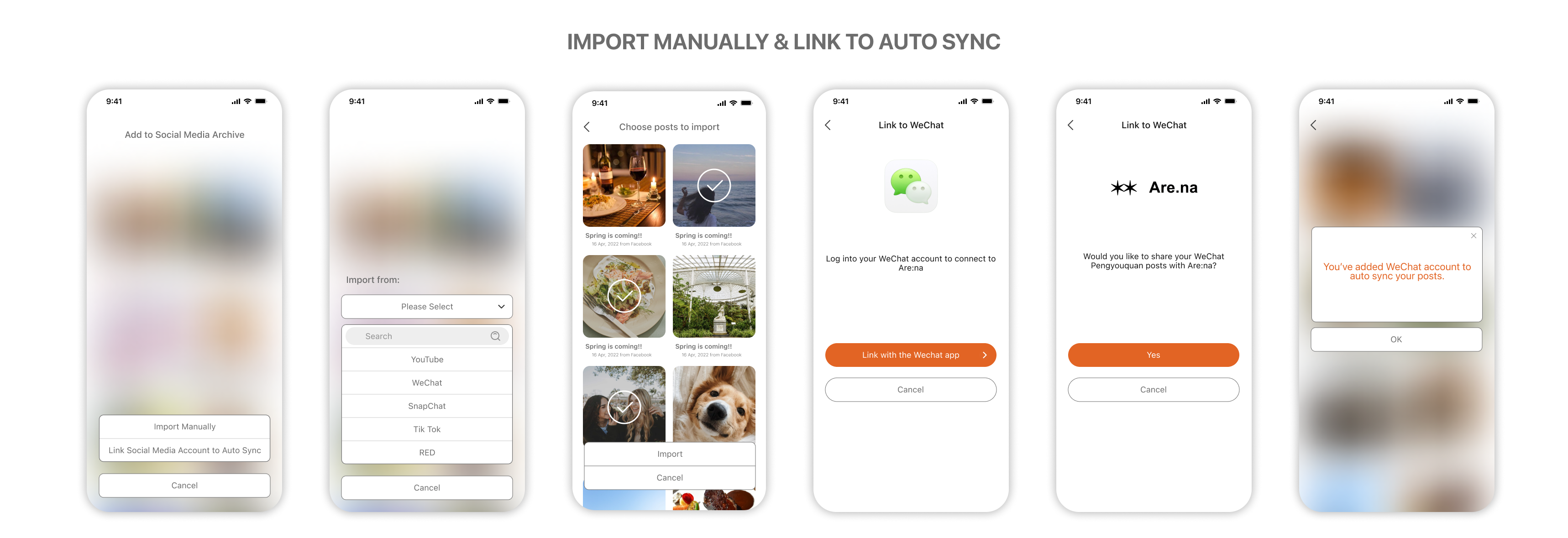
The way that Are.na works is to link and connect your posts. So it will keep updated and you can easily choose all the platforms you need to link your posts into Are.na.
Methods:
The Iterative Cycle of Human-Centered Design & Double-Diamond Model of Design
01
Define & Research
Understand the problem
Interview
Survey
Competitive Analysis
Persona
02
Design
Journey Mapping
User Flow
Sketching
Wireframing
Prototyping in Figma
03
Evaluate
Usability Testings
Design Iterations
Success Metrics
– Define & Research –
Why design?
I’m a social media holic with over 20 social media accounts. I post self-generated content to record my life on these different platforms.
When I first started this project, my professor wanted us to redesign an existing app within 2 months. Through observation, I found that many people, including me, would like to snap photos, shoot videos, and write to document their lives and post them on many different platforms, especially some influencers with various social media accounts.
Some people are serious about compartmentalizing their postings, but many more don’t bother to review and organize their postings. While we all like to appreciate self-generated content, we don’t like to take the time to organize it.
Sometimes I can’t find a certain post when I want to, sometimes I want to reminisce about my past (I’m a person who likes to look back at my past), and I realized that I’ve posted a little bit on each platform but not all of it. Also, I noticed once my content has been deleted and I can’t get it back.
But then I remembered that in the days of using film cameras, my dad took many, many pictures of us, and I have many large photo albums at home that hold all of our family memories.

What’s the challenge?
So the challenge is to make it easier to organize, categorize, find and share personal posts, so that people can easily find these posts scattered across different platforms years later. How to make this process of organizing photos into a photo book and reviewing and finding them easier is the focus of my research.
Problem Statement V1.0
So I came up with my initial problem statement:
The posts scattered on different social media platforms make it very difficult to integrate, manage, and organize all of one’s own posts. The new generation of devices, the loss of accounts, misuse, etc. can make people’s posts deleted accidentally.
Design a feature to allow all ordinary people to back up all their self generated content to prevent accidental deletion and loss, and easily generate memoirs, as well as manually organize and classify them, so that users can better review their own past and organize their own records of life, and have a collection of all digital records of one’s life & posts.
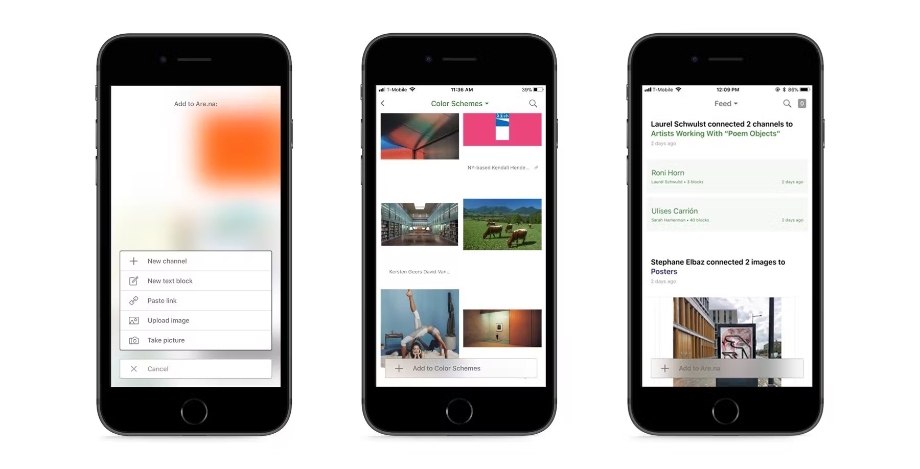
Then I found out that Are.na is a great platform for organizing and categorizing content. It is an online tool for contextualizing the Internet, like a visible web bookmark, so that users can categorize all the content. I wanted to leverage Are:na’s organizing capability and incorporate the feature into it.
Survey
To see if other people had the same need like me, to clarify exactly what problems users were having, and to understand user behavior and thoughts in order to guide design direction and features, I created a survey with questions about documenting life, social media, and organizing blog posts.
However, after receiving 48 responses, the results revealed a few unexpected findings.
- Many people don’t take the time to reflect on their lives or keep a journal.
- The vast majority of people (82%) use more than three different platforms to share their content, and 32% use more than six different platforms. (This information isn’t always about their personal lives.)
- The majority of people (69.5%) are willing to organize their social media content like a photo album.
This survey result perplexes me: why do people choose to organize their photos into photo albums in the era of film cameras, but not in the digital era? What is the driving force behind this kind of organizing activity? Is it to communicate with friends and family and share emotions? (In the days before digital cameras, people shared their lives through photo albums; today, they do so through social media.) Is it for the purpose of communication and information gathering (cognitive demand)?
User Interview
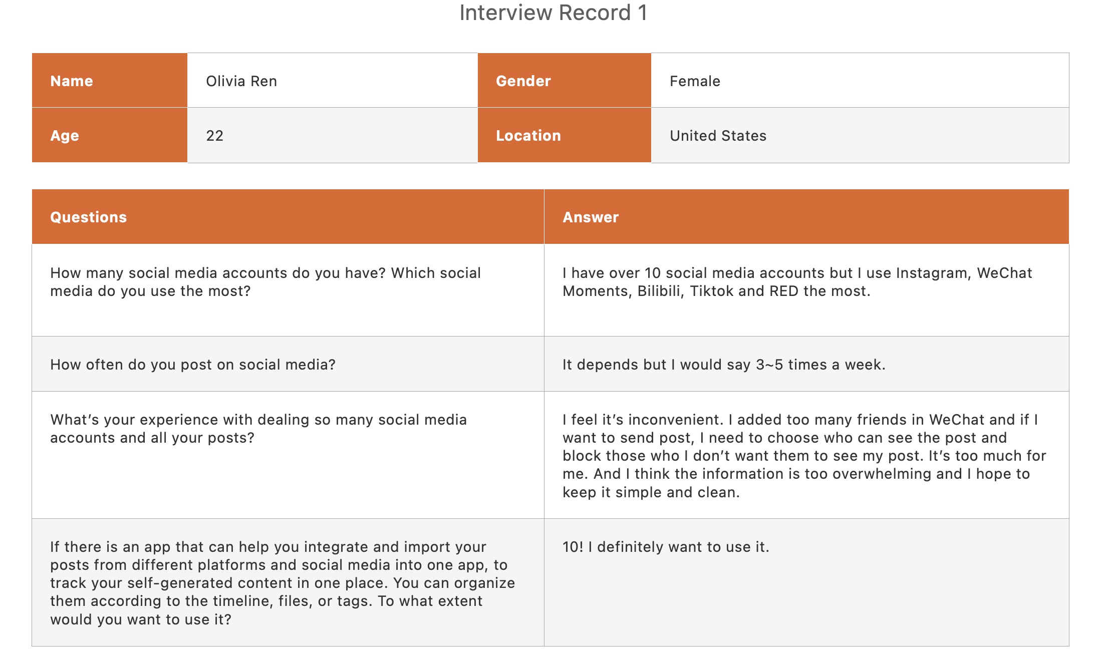
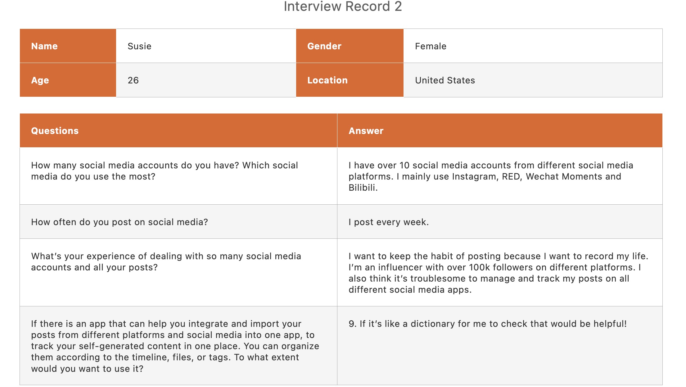
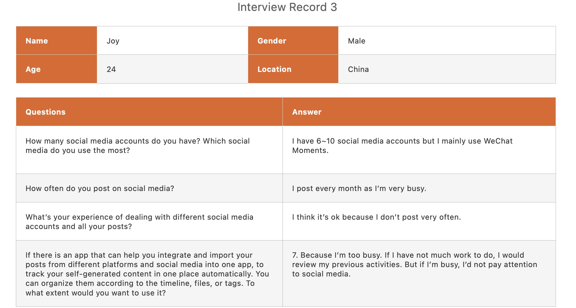
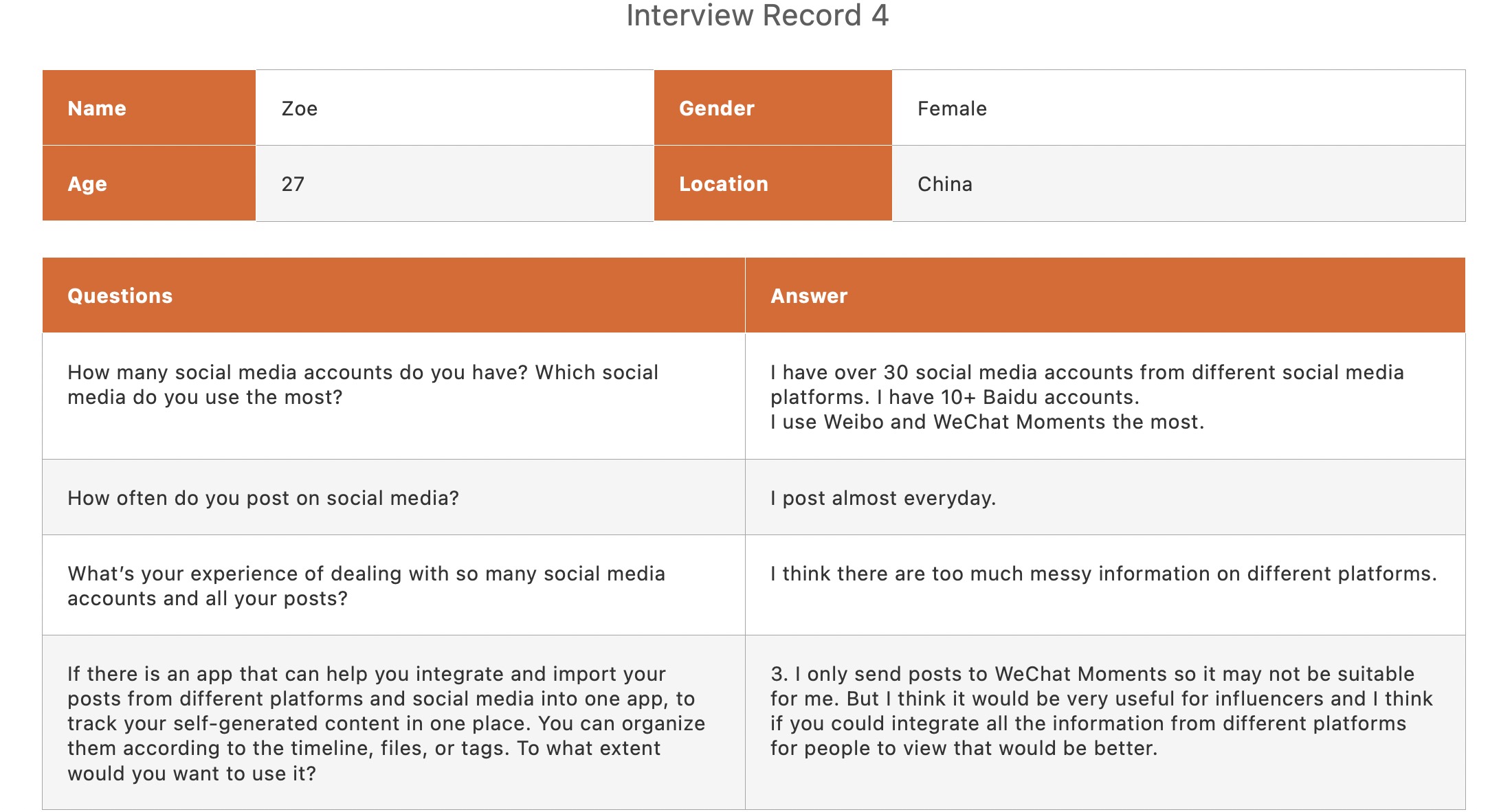
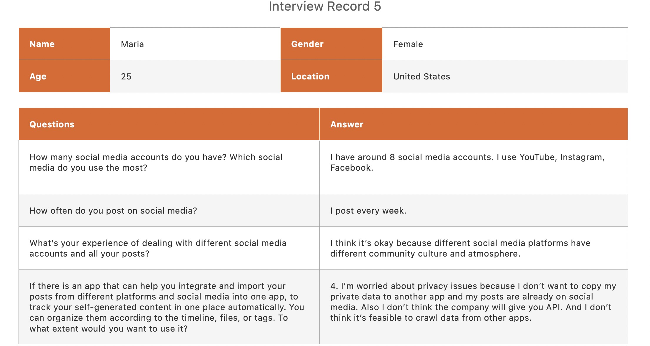
I wanted to know why people don’t look back specifically at their past and what challenges they face when posting content on various platforms, as well as what the real problem are about posts scattered across various platforms and what people’s needs are, so I invited five people for user interviews.
One of them was a social media influencer with over 300k followers across multiple platforms. She is a vlogger who enjoys recording her daily activities and sharing them on various social media platforms.
Findings:
- Ordinary users update posts less frequently and pay more attention to the community atmosphere of different platforms, and they prefer to browse others’ posted content. This problem is primarily found in people who like to record their lives, especially some life vloggers, who frequently take photos or videos to record their daily lives, whereas people who do not take many photos or videos to record their daily lives do not have a strong demand in this area, because ordinary users update posts less frequently and pay more attention to the community atmosphere of different platforms, and they prefer scanning others’ content.
- As a result, there isn’t much need from ordinary people who just view other’s posts. They are more likely to come across old photos and find them interesting, but they are less likely to reflect on their past experiences and lives.
- Many people will enjoy looking back on old posts because they will evoke memories and, as a result, emotional experiences.
- Some people who enjoy taking good-looking photographs and value their work will also contribute to a positive aesthetic experience.
Competitive Analysis
In order to examine whether existing products could help, I looked into the market:
I found that:
- Pinterest allows users to organize, file, and share their publications by topics, interests, or hobbies but it could not organize all your social media posts, it is focused mainly on pictures, and photos.
- Hootsuite is a social media marketing & management dashboard but it does not provide a whole archive for normal users who just want to see all previous posts. It is designed more for influencers, big organizations, and companies who need to post content regularly, attract fans to market and keep track of comments. Also, the platforms they provided are limited to merely 6 major English-speaking countries’ social media apps.
- ArchiveSocial is a to B platform that helps companies archive social media content and recover accidentally deleted content. It is expensive and is only used to backup content.

Persona – Who are users?
People who like to document their lives, create content, and share it on a variety of social media platforms, particularly lifestyle netizens, are the target audience for my product. I created a persona to help me empathize with users and better understand their behaviors and processes, as well as to provide direction for subsequent design guidance.
– Design –
Brainstorming & Ideation
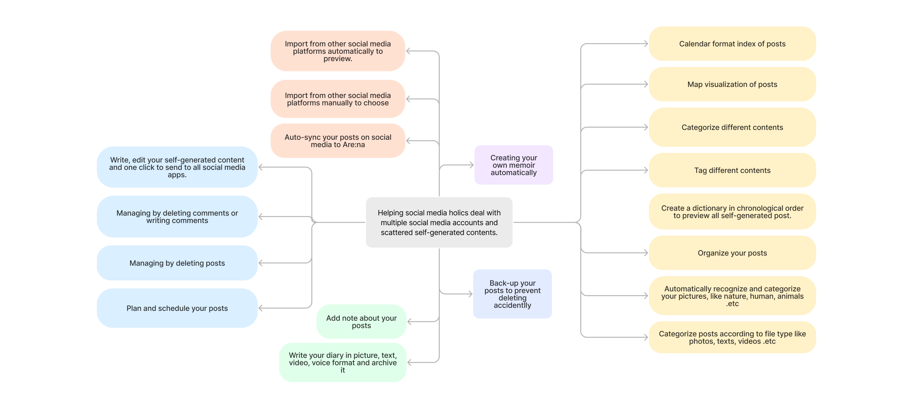
With the research findings and persona in mind, I decided to have an ideation session to come up with as many solutions/features as possible. I tried to not limit myself and be inventive.
I believe that even the most bizarre ideas, which frequently contain obvious flaws, contain potential ideas that can be extracted later and applied to the final idea selection. It’s critical not to dismiss any ideas too quickly.
Feature Prioritization
I talked with the computer engineer about all of the features that had been discussed in order to confirm the product’s technical feasibility, and I learned that:
- Backing up the posts is not possible due to other platforms’ APIs being closed and their inability to crawl data. It also brings up the issue of data security. So I ditched the backup plan and relied on Arena’s connect feature to save the link.
- Because the cost of maintenance and updates is too high, one-click publishing to multiple platforms is also not possible.
- Also, creating memoirs is currently not possible due to the fact that the information is held by other companies and platforms.
- Due to time and cost constraints, using artificial intelligence for identification and classification is not feasible at this time.
So I got rid of the unworkable features and used the MoSCow model to help me decide which ones to keep in the first version.
The following features were eventually decided to be kept.
A post album/archive of all the different platforms, similar to an Are:na “channel,” where all the “blocks” are the user’s posts on all the different platforms’ “blocks.” (With a picture, explain what Are:channels na’s and blocks are.)
To prevent users from accidentally deleting files, there is a Recycle Bin. (The current Are:na lacks a recycle bin, which could lead to users accidentally deleting files.)
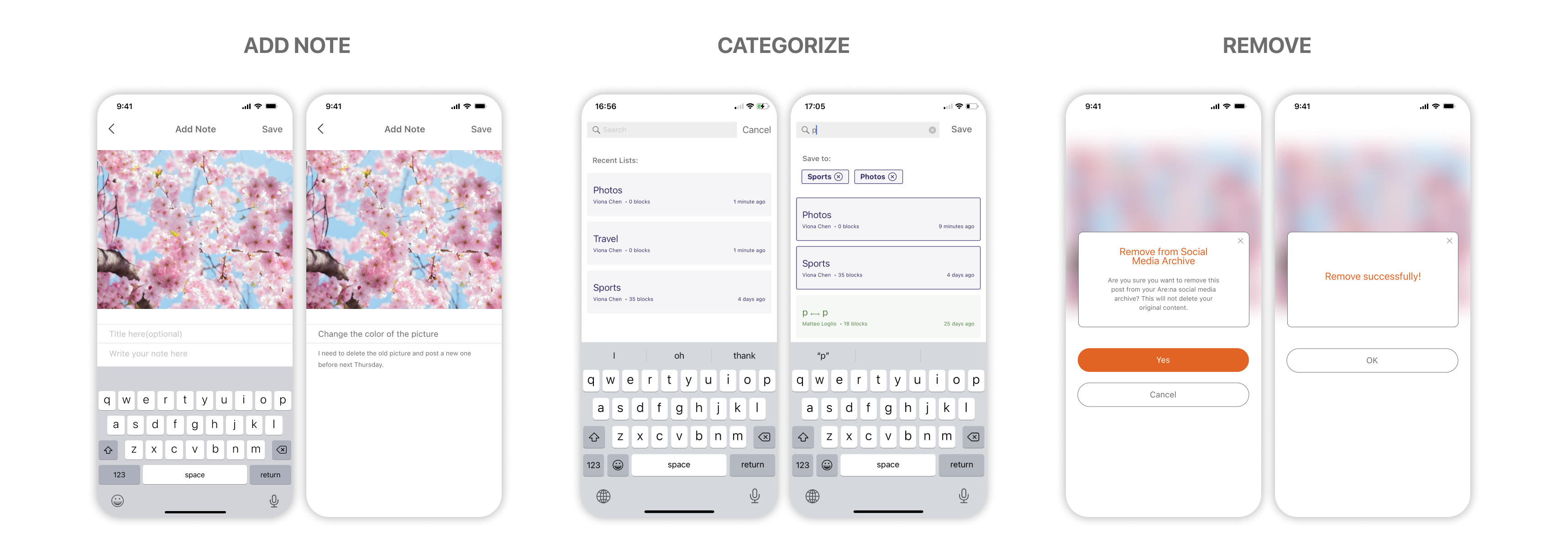
At the bottom of the page, there is a navigation bar. (The current Are:na page navigation is at the top of the screen and must be activated by clicking a small triangle.) Add notes and memos to your posts to help some people who want to improve the quality of their posting take notes. This doesn’t fit the user’s conceptual model, so I chose to use the mainstream bottom navigation.)
In chronological order, sorting and categorizing.
Community, similar to the Are:na community where users can share channels with others, allowing users to freely share all of their posts or individual posts.
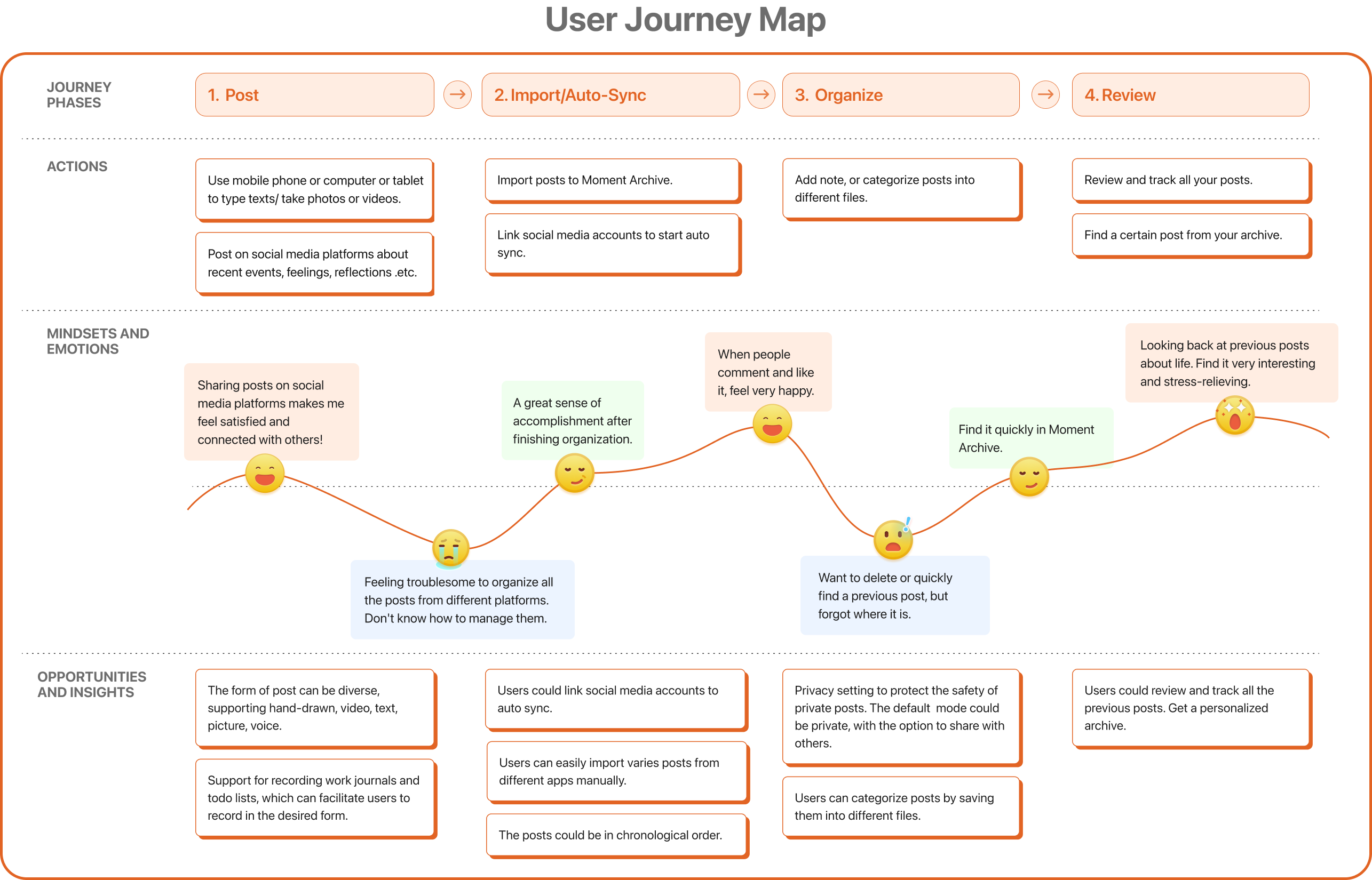
Journey Map
I also made a user journey map so that I could visualize the customer’s journey and see what interactions the product should support. This also aids my understanding of the user’s usage scenarios and context.
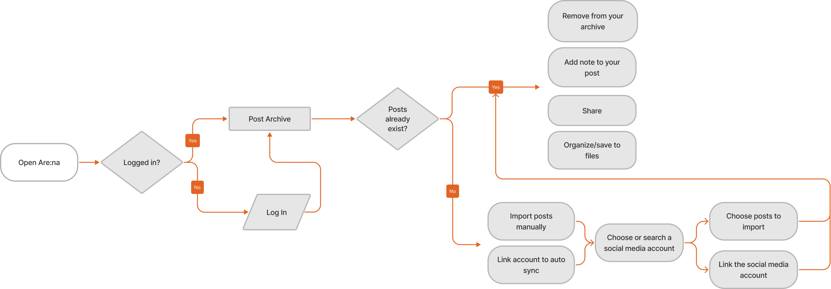
User Flow
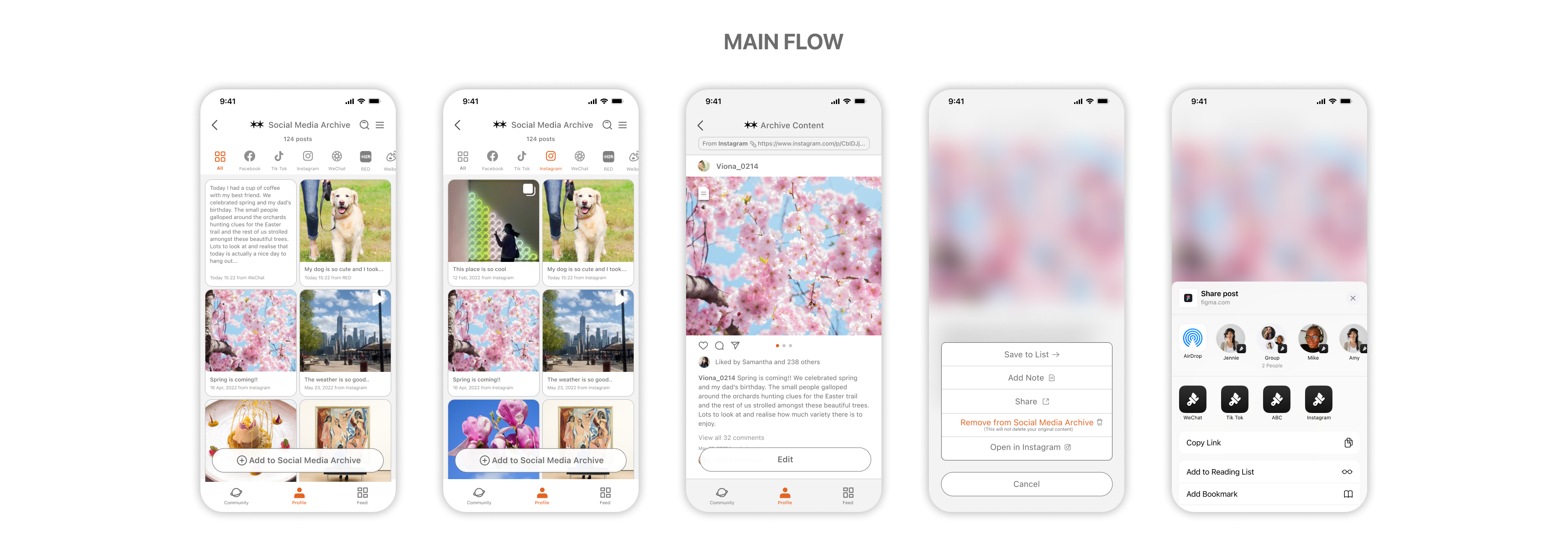
In order to enhance the ease of movement through Moment Archive, make it easy to assess the efficiency of the interface, as well as evaluate and optimize the user experience, I decided to create a user flow to lay out all the touchpoints and guide the subsequent design by clarifying the flow of tasks and interactions that users will encounter during use.
Sketch, Wireframe & Usability Testing (Session 1)
I quickly drew out sketches of these functions.
Then I conducted three rounds of usability testing and iterations throughout the wireframe to prototype process to ensure the product’s usability.
Round 1: I read Steve Krug’s Test script before each testing session to ensure that everyone knew what the test was about. Then I presented five potential users with Lo-Fi wireframes and clickable prototypes for usability testing. I explained what Moment Archive was, who the target users were, and what Are.na was, ensuring that everyone knew what they needed to know.
Feedback (Session 1)
Following the testing, I came away with the following conclusions.
Multiple users requested the ability to sort by platform and time in order to find the post they were looking for quickly. As a result, I decided to include the option to sort by platform.
One user inquired about privacy, and since some social media platforms are set to “only visible for three days,” others who want to share it with others may not see it if it is set to “only visible for three days.” As a result, I abandoned plans to add a community feature. Users wanted to search for updates and send them to others, so I decided to keep the sharing feature.
“I wanted a tab with icons for various social media platforms so they could switch between them to see posts from different places,” says the designer.
“I don’t think you have to let users organize; I mean, if browsing my posts is a little inconvenient for me, I have to manually sort them.”
“I don’t believe you should add sharing and community features to Moment Archive because you can share on other platforms already.” There would also be issues with privacy, such as some of your posts being private on other apps such as WeChat. For example, I use WeChat Friends (PengYouQuan) and limit the duration of my posts to three days. As a result, I believe it is preferable for me to keep my own diary or archive.”
I began working on the high-fidelity prototype in Figma after receiving the feedback.
Hi-Fi Design & Usability Testing(Session 2)
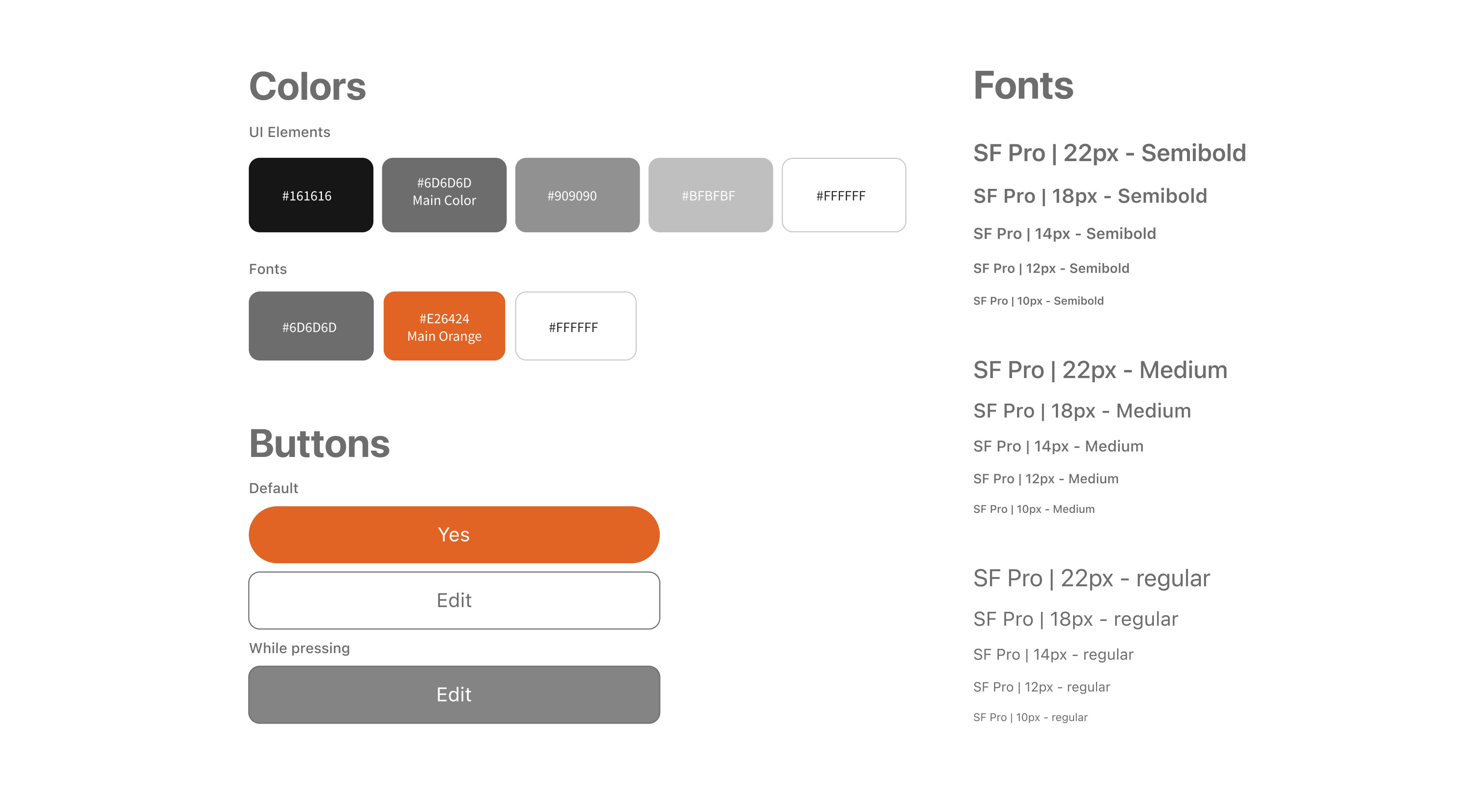
Before dive into Hi-Fi interfaces, I looked at the visual design of Are:na closely. I found the design system looks really nice so I decided to use the existing color theme to stay on brand.
Clickable Prototype( 1st draft)
Feedback (session 2)
After finishing the hi-fi prototype, I tested and received feedback from five other users as well as my professor. They asked:
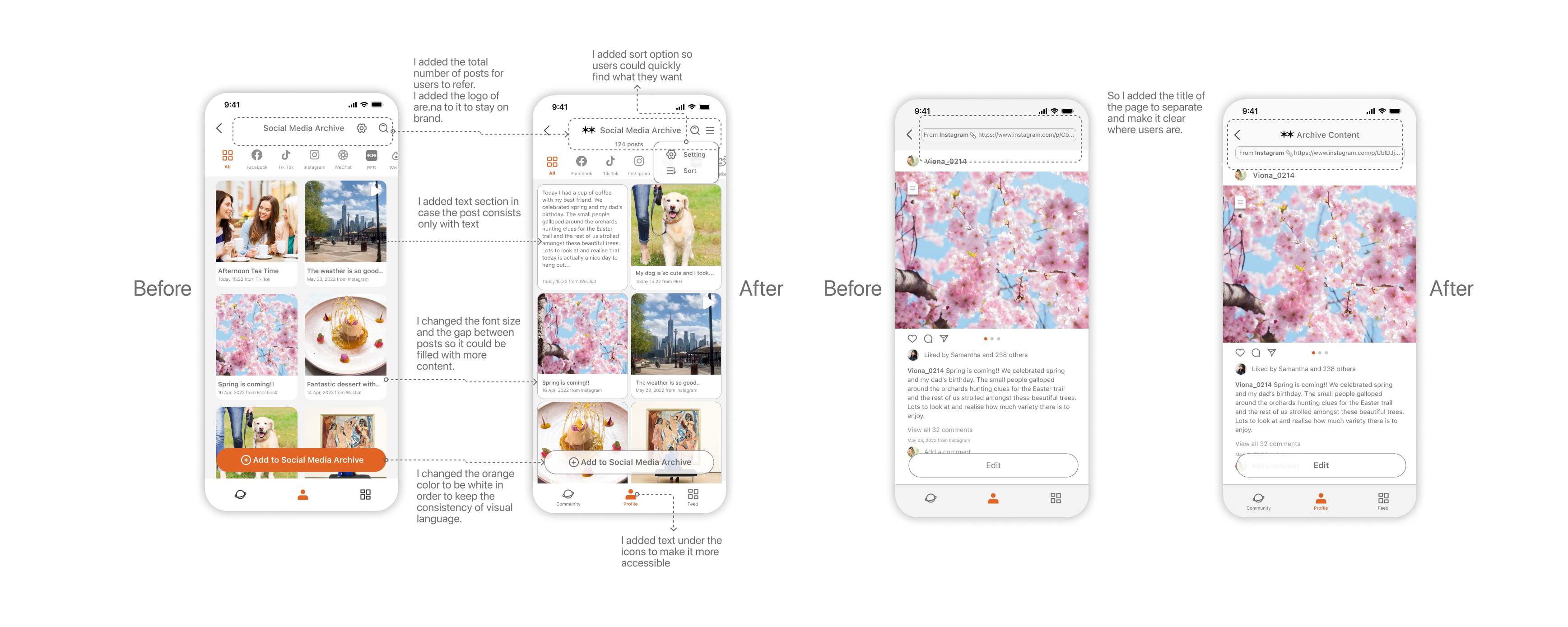
“What if the post is entirely made up of text? How does it appear?”
The archived content page perplexed them because it looked too much like the platform interface they were used to. They may be perplexed as to their location.
They want to sort by date so they can find the information they need quickly.
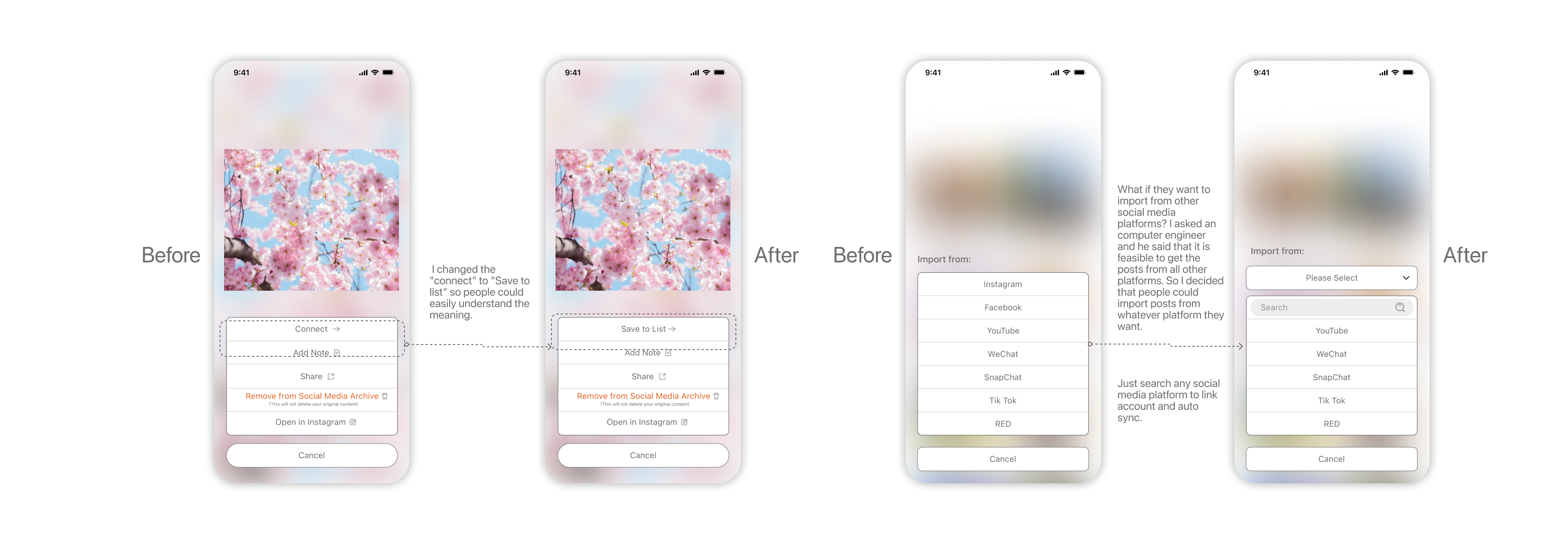
The word “connect” made them confused. — It means to save, to sort your things into files, as I explained in Are.na. They prefer the term “save to list” because it helps them understand what it means.
What if they want to add content from other social media sites? There are only seven platforms listed here.
Iteration
So I iterated my design according to the feedback from usability testing.
Final Design
(Second Draft)
Final Design – Clickable Prototype
You could interact with the clickable prototype to view the details.
SUCCESS METRICS
I planned to conduct a final round of testing and created a survey and use HEART model to measure users’ happiness and task success.
Happiness is based on the product reviews, as well as whether the product meets and exceeds the users’ expectations. Task success is measured by the percentage of correctly completed tasks by users. The process is similar to the first 2 sessions but at the end of test, I asked them to fill out a survey consist of 5 questions to know their reviews and attitude.
NEXT STEP
For next steps, I am going to:
1. Contact Are:na to check if there is potential cooperation opportunity.
2. Before releasing this product, I’d consult with the product manager to determine what KPIs we should track and what constitutes success.

